Overview
The goal was to create a clearer, conversion-focused experience that could guide parents, many new to homeschooling, through complex multi-step curriculum decisions.
End-to-end ownership across UX strategy, product architecture, UI system design, and front-end implementation, writing production HTML, CSS, and JavaScript within a Java-based CMS and deployment pipeline.
THE OPPORTUNITY
A decades-old K-12 ecommerce platform needed a complete rethink — from navigation architecture to product structure — to guide first-time homeschool parents through complex curriculum decisions.
The Problem
The existing experience suffered from several systemic issues that made it difficult for users, especially first-time homeschool parents, to understand and choose a curriculum path.
Pages lacked CTAs and guidance, leaving users with no clear next step. A Special Offers page with 93% drop-off was emblematic of the systemic problem.
Multiple redesigns over time had created visual and functional inconsistency across the platform. Long, dense pages buried important information under poor hierarchy.


Users had to choose between full kits vs. individual subjects, and textbooks vs. textbooks with video lessons without clear structure or guidance to support those decisions.
Competing navigation systems, including tabs, menus, and page-level controls, spread key decisions across inconsistent UI patterns, creating confusion and high drop-off rates.

THE GOAL
Redesign the platform to drive conversions and grow sales — through clear structure, guided paths, and intuitive interactions — so parents can confidently choose the right curriculum for their child.
Research & Discovery
I was brought in through Precept Marketing, BJU Press's external marketing partner, with a broad mandate: redesign the platform, rethink the customer experience, and improve navigation and product structure ahead of a new product launch. Before a single screen was designed, I spent time understanding the problem space from multiple angles.
Worked directly with BJU Press marketing and Precept's director to understand business goals, upcoming product launches, and the organizational constraints that would shape the project.
Reviewed a user journey needs document mapping page-level traffic, bounce rates, and drop-off data, surfacing critical failures like Special Offers (93% drop-off) and Textbooks (0.08% traffic share).
Walked the existing platform end-to-end and reviewed competing K–12 curriculum sites to document UI inconsistencies, navigation failures, and structural patterns worth adopting or avoiding.
Met with the internal IT team early to understand the dev environment, CMS architecture, and deployment workflow, establishing access via VPN to a staging site before any code was written.
From the User Journey Brief
Stakeholder-Identified Problems
Have to scroll for a while to get to the first potential CTA. Easier navigation or multiple CTAs throughout the page.
— Online Video Courses · 30.9% drop-off
Our customers arrive here and clearly are unaware of what to do next. Our drop-off is far too high.
— Special Offers · 93.2% drop-off
Lots of information for new homeschoolers, but there's still obscurity when it comes to where to go next.
— New to Homeschooling · 62.8% bounce
Traffic has been historically low. Looking for recommendations on potential earlier CTAs.
— Textbooks · 0.08% traffic share
Constraints
Fragmented prior redesigns had created a patchwork codebase requiring careful front-end workarounds within a Java-based CMS.
Marketing, development, and internal teams each had differing priorities that needed to be balanced without compromising the user experience.
A large volume of existing content couldn't simply be removed (ie. Testing). Structure and hierarchy had to improve without disrupting ongoing business operations.
Design Strategy
Three core strategies guided every decision across the redesign:
Re-architect Navigation & Structure
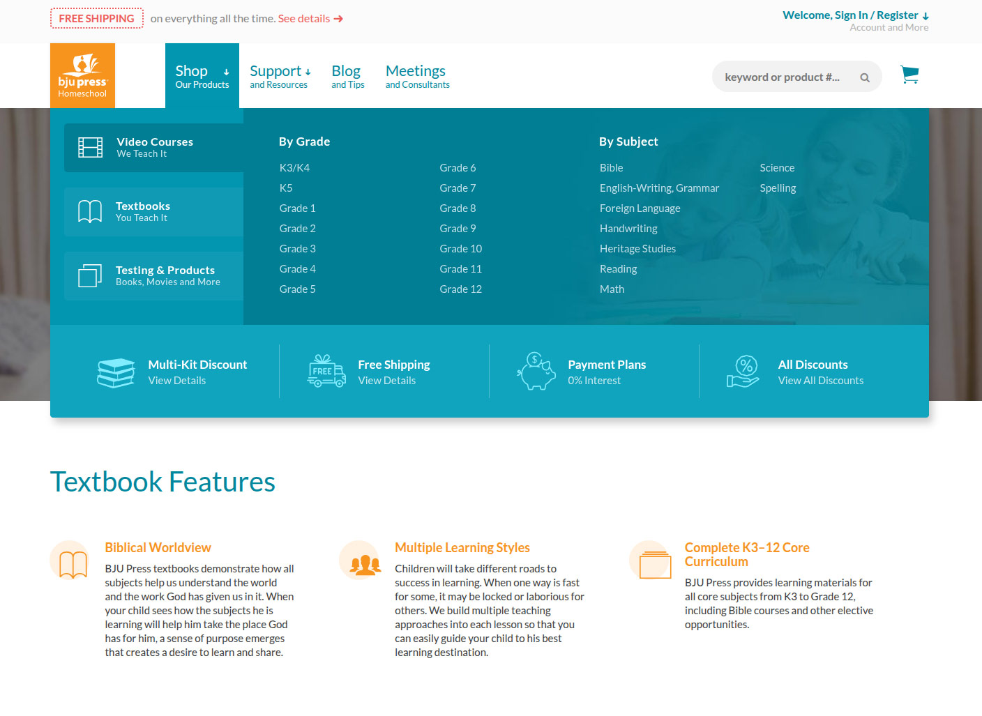
Removed competing navigation systems (tabs vs. menus vs. page-level controls) and introduced a mega menu with clear, purposeful entry points for Video Courses, Textbooks, and Testing & Products, moving product decisions into navigation instead of burying them deep in page content where users had already dropped off.
Clarify and Scale the Product Model
I surfaced and elevated an existing mental model into the primary navigation framework because it mapped directly to how BJU Press already described their offerings in their own marketing language: "We teach it" (Textbooks + Video Lessons) and "You teach it" (Textbooks only), supported by simple iconography to improve recognition and scannability. Applied consistently across navigation and product pages, this reduced decision fatigue and clarified product selection.
Build a Consistent, Scalable UI System
Standardized icon + title + description blocks, CTA structures, and section layouts, then applied them across marketing pages, product pages, support content, and third-party integrations like PowerReviews. Even legacy pages (ie. Testing) that couldn't be fully rebuilt gained coherence through shared components.
Collaboration
I worked across marketing, development, and external partners throughout the project, navigating competing priorities and organizational friction to keep the work moving forward.
Shared via InVision for stakeholder review and feedback
Check-ins
Iterated based on stakeholder and internal user feedback
Directly translated designs into production HTML/CSS/JS
Proposed structural improvements beyond the initial brief
Just go for it. Build it and show them how much better it works.
— External Marketing Director, Precept Marketing
For the mega menu redesign I identified that the existing navigation forced users through multiple page loads just to reach a product: top-level link → page → subject → grade. I researched solutions independently and redesigned it to surface all of that decision-making directly in the menu itself: product type tabs with 'We teach it / You teach it' iconography, with grades and subjects immediately accessible beneath, eliminating three page loads from the path to purchase. Got stakeholder sign-off to build directly, minimizing unnecessary mockup cycles.
Navigating organizational dynamics
Worked directly within BJU Press's internal dev environment via VPN, writing and testing all production code on staging before publish. Despite early friction with the IT department, I maintained professionalism throughout.
Handoff documentation
At project close wrote internal documentation covering how to manage every custom component I'd built.
Iteration
Design decisions evolved continuously through stakeholder reviews, internal testing, and proactive proposals, including structural changes that went well beyond the original brief.
Tested two layout directions
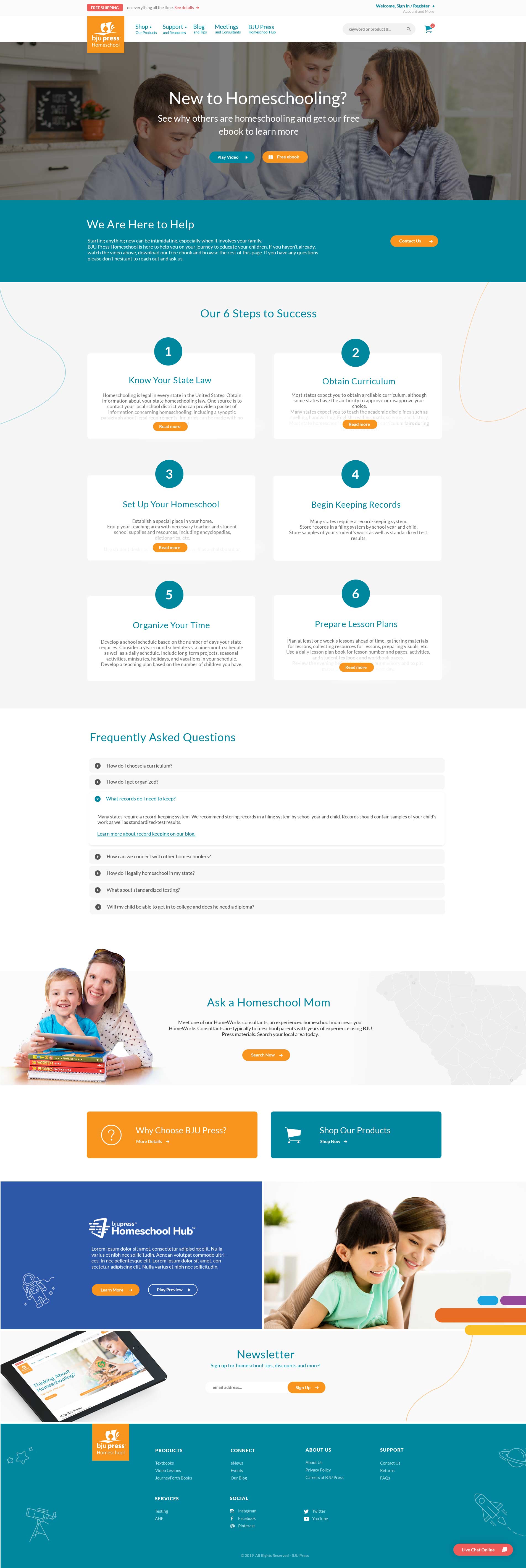
Presented both a 6-up grid and a slider layout to stakeholders for the New to Homeschooling page before committing. The slider was chosen for its reduced vertical footprint and more concise scrolling experience, a pattern carried forward into the 6 Steps to Success section.
Consolidated duplicate pages
Identified that "Getting Started with Distance Learning" and "myDL" were redundant and proposed combining them into a single destination, reducing navigation confusion and content duplication. Stakeholders approved immediately.
Refined from real usage feedback
Bi-weekly check-ins surfaced real usability issues, ambiguous wishlist save behavior, mobile menu scroll problems, and unclear clickable areas, each identified, iterated, and resolved before launch.
New to Homeschooling — Layout Directions
Option A — 6-up Grid
Option B — Slider Layout (chosen)
Special Offers — Design Variants
Option A — Countdown Banner
Option B — Inline with Offers

Before
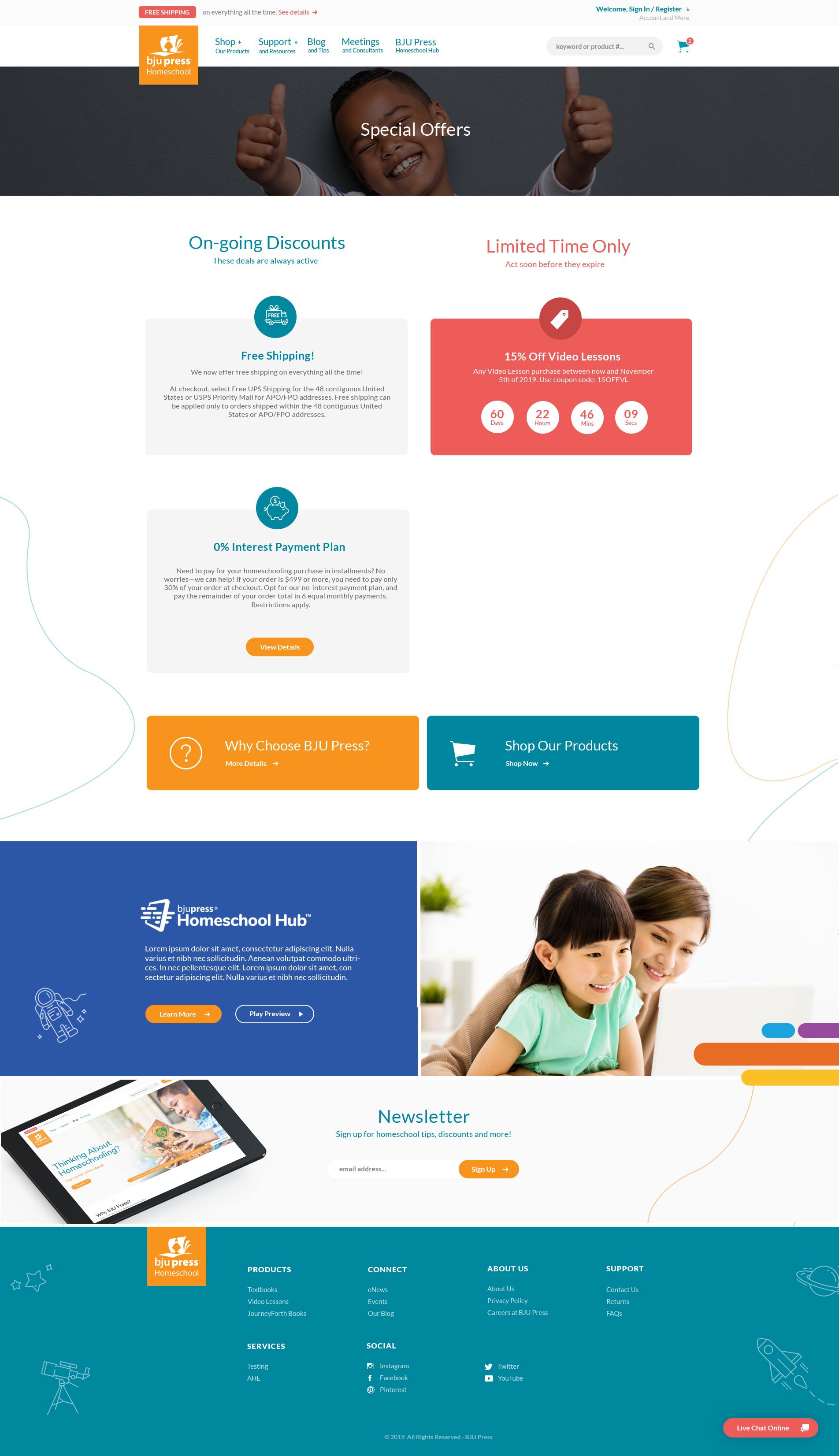
Rethought the Special Offers structure
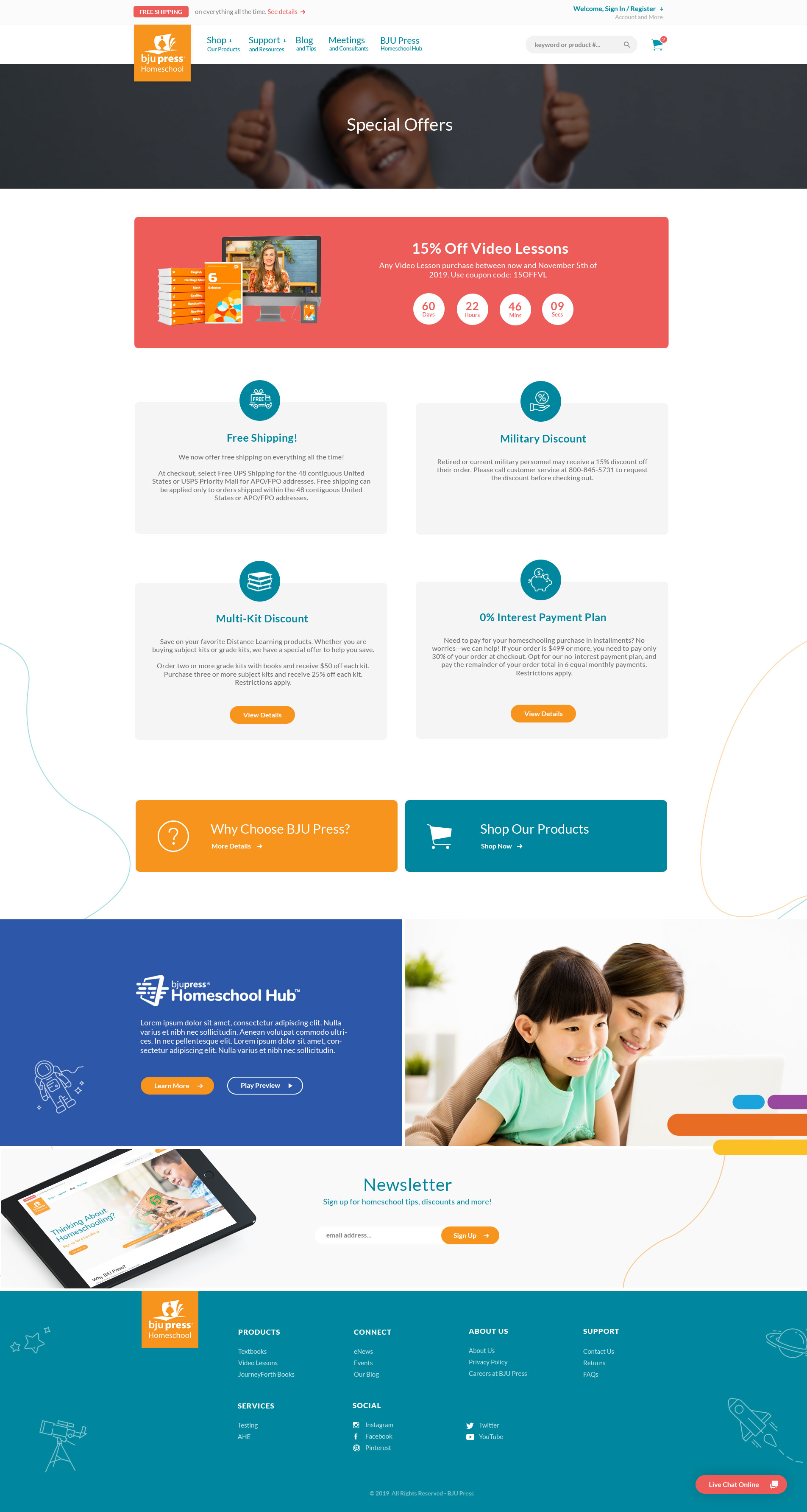
Proactively questioned whether the page needed category structure, proposing "Ongoing Deals" vs "Limited Time Offers" to make the page useful year-round rather than a dead end when no promotions were active.
Proposed a countdown timer beyond the brief
While coding the sale area, I identified CTAs as the primary fix, users needed a clear next step regardless of whether offers were active. I also proposed a countdown timer proactively mid-build as an added urgency boost, which marketing approved immediately.
Explored mega menu layouts
Explored an alternate mega menu layout before finalising the tabbed approach, validating that the three-tab structure with grade and subject filtering was the clearest path for new homeschool parents.
Key Improvements
A page-by-page breakdown of problems identified, solutions designed, and measurable outcomes. Drag the slider to compare before and after.
Navigation & Structure
Problem
Conflicting navigation patterns (tabs + menu + page-level controls), unclear "Textbooks" vs "Video Lessons" split, and key decisions buried deep in page content — especially painful for new users.
Solution
Rebuilt navigation using a mega menu. Surfaced "We teach it" / "You teach it" terminology and moved all product-type decisions into navigation rather than page content.
Impact
Less confusion when choosing between product types
Faster path from homepage to category pages
Clearer first impression for new homeschool parents
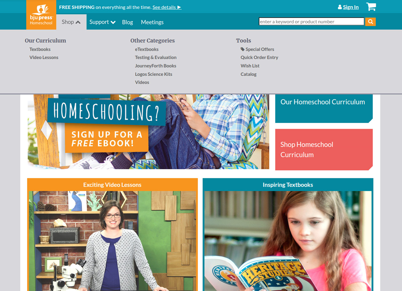
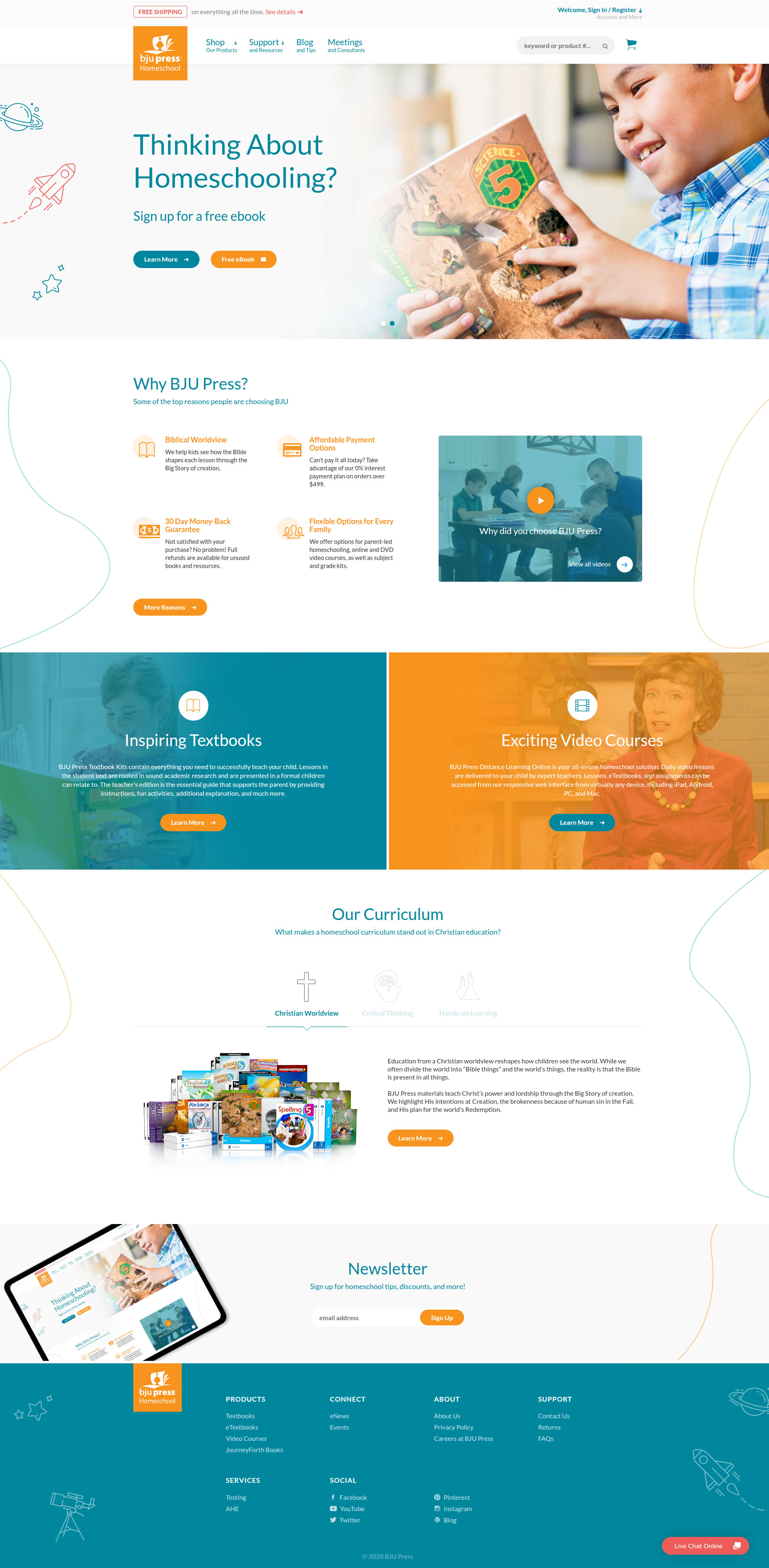
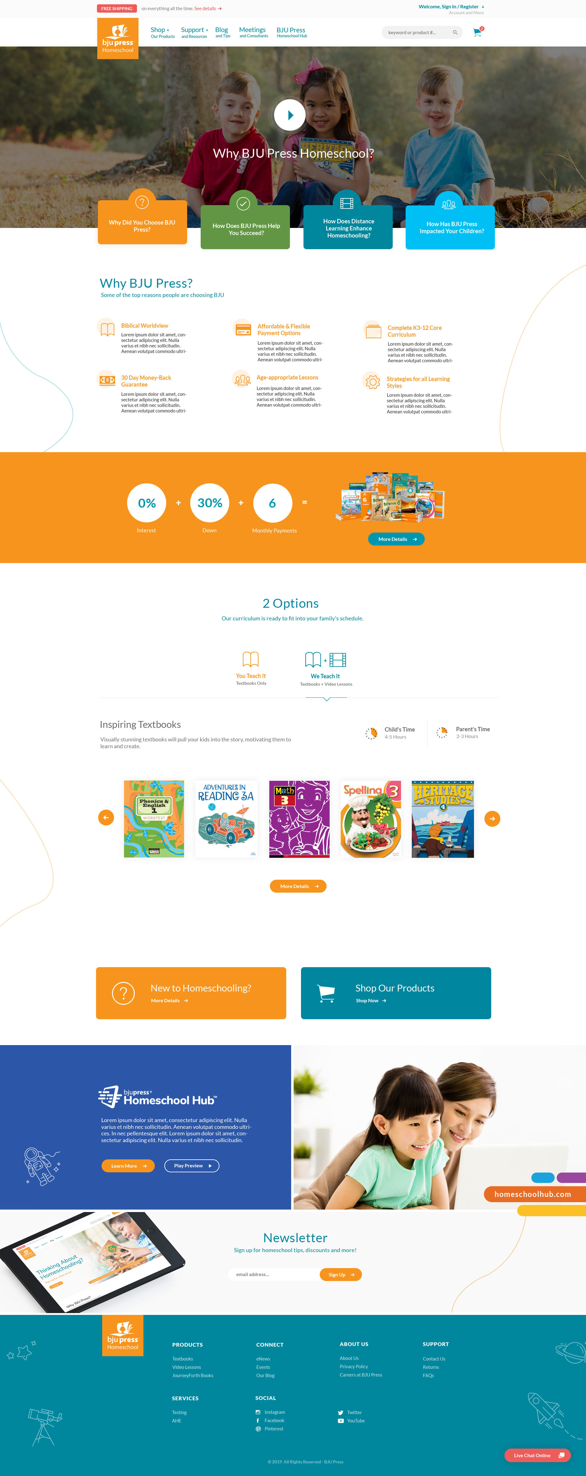
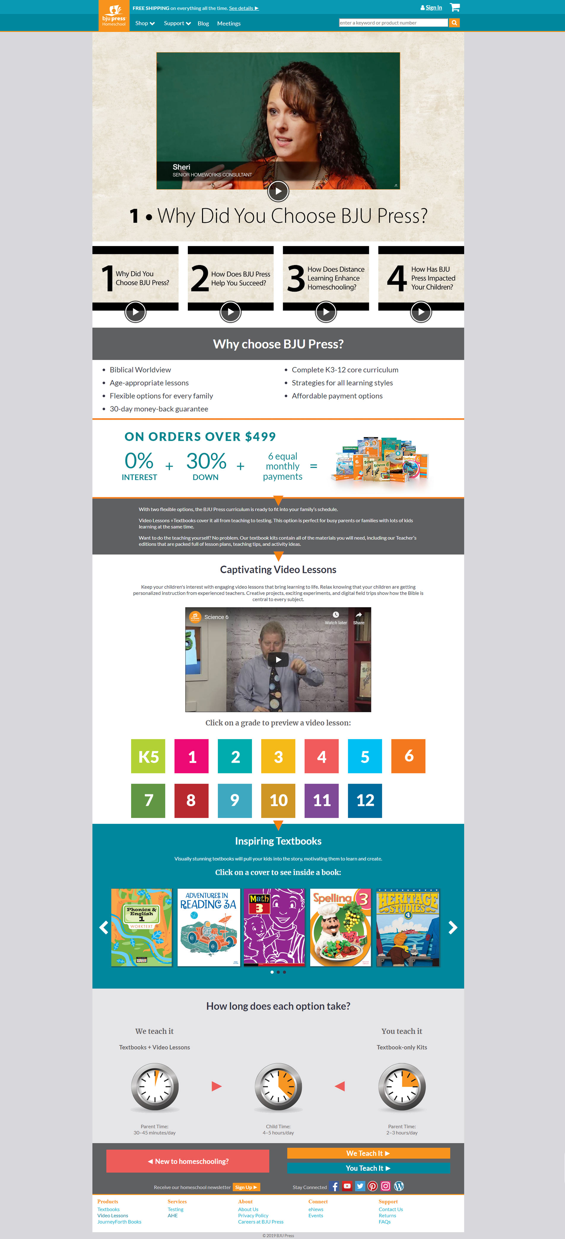
Homepage
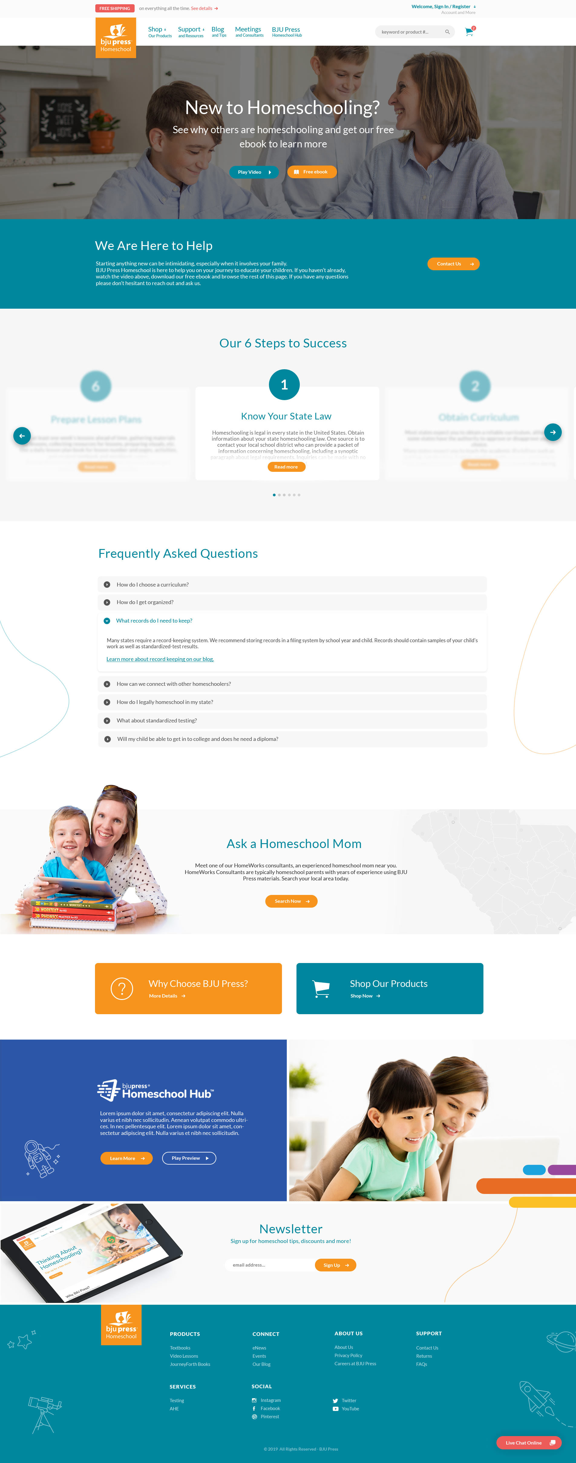
Problem
A bare homepage with no marketing pull. The hero was a passive image with no explicit CTAs, account access was a plain "Sign In" link, and there were no sections communicating curriculum value or differentiation, leaving first-time parents with no reason to stay or explore and no strong pathways into product pages or clear differentiation between offerings.
Solution
Redesign focused on engagement and guidance. Added explicit hero CTAs, upgraded account access, and introduced two new sections, "Why BJU Press" with reasons and video, and "Our Curriculum" with a differentiated slider, giving parents a clear, structured path into the product ecosystem.
Impact
Stronger first impression and clearer value communication
Established layout patterns used across the entire platform
Increased engagement with key entry points
Marketing Pages
Marketing pages were inconsistent, text-heavy, and lacked clear user direction. I introduced a standardized page structure, hero with primary CTA, scannable icon + title + description blocks, and a consistent layout applied across all marketing surfaces.
System-Wide Principle
Eliminating Dead Ends
Across every page I added persistent CTAs, cross-links between related paths, and exit pathways so no page acted as an isolated endpoint. Every surface was designed as part of a connected journey.
Marketing
Why BJU Press
Problem
Traffic sat at just 1.23% with a 65.8% drop-off rate. Content was cluttered and presented as simple bullet points with little visual hierarchy and no guidance toward the next step as CTAs were hidden near the footer.
Solution
Replaced bullet lists with structured icon + title + description content blocks. Introduced clearer CTAs throughout and improved homepage integration to drive traffic to this page.
Impact
Marketing
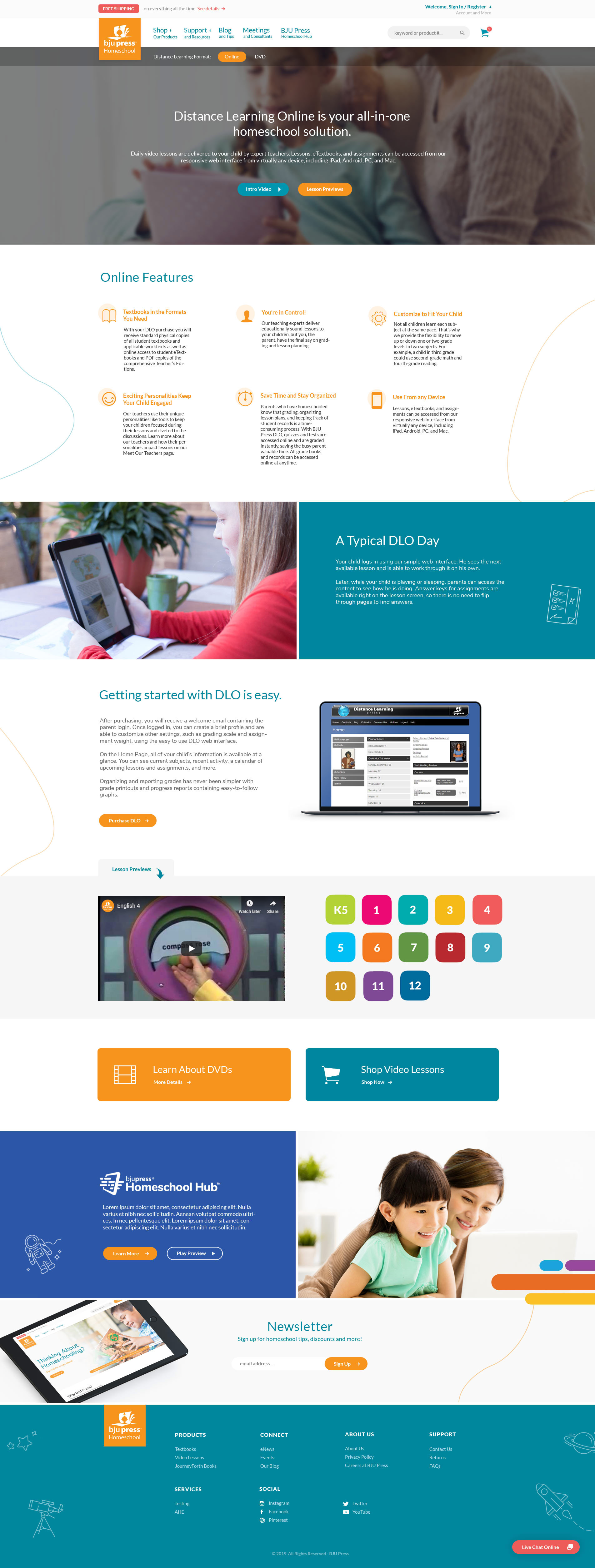
Online Video Courses
Problem
30.9% drop-off. The hero was dominated by a video with no supporting text or direction. Users had to scroll significantly before encountering any CTA, with no preview content to drive exploration.
Solution
Redesigned hero with clear headline, supporting description, and dual primary CTAs (watch video / preview lessons). Added interactive grade-level lesson preview tabs (K–12) and distributed CTAs throughout.
Impact
Marketing
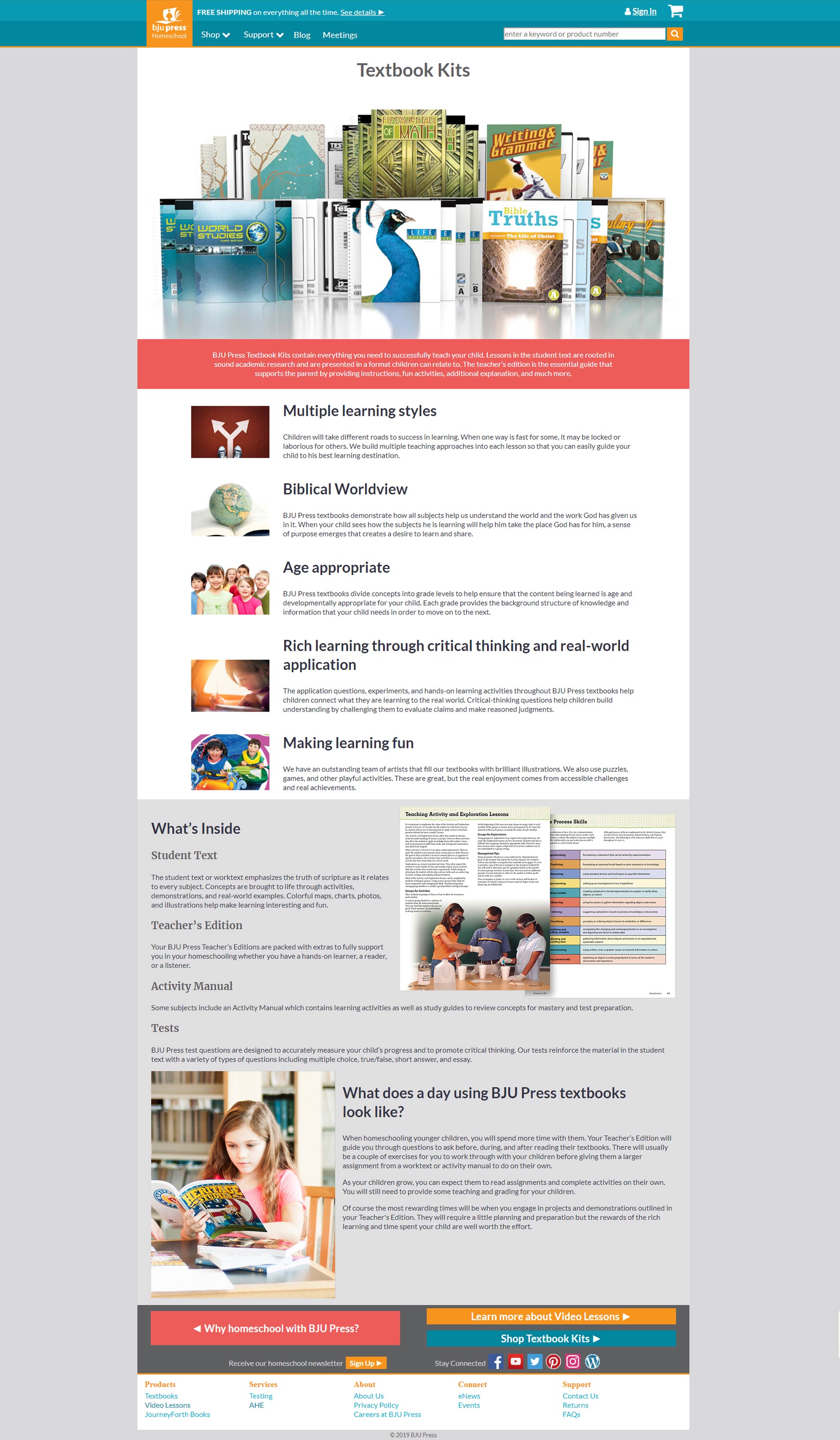
Textbooks
Problem
Traffic at only 0.08% with a 50% bounce rate. The page had almost no homepage visibility, CTAs blended in with the footer, and a dense layout made it nearly impossible to scan.
Solution
Increased homepage visibility through "Our Curriculum" block. Introduced early high-priority CTAs above the fold. Simplified layout hierarchy and applied the consistent marketing page structure throughout.
Impact
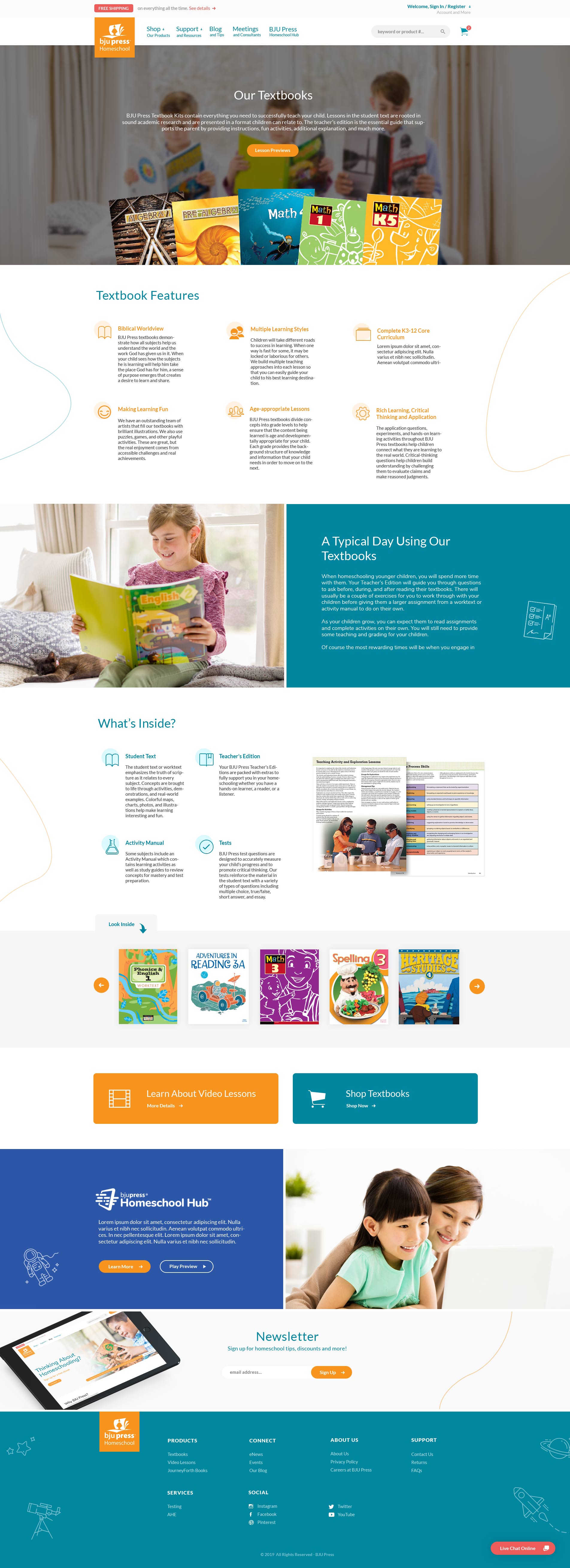
Marketing
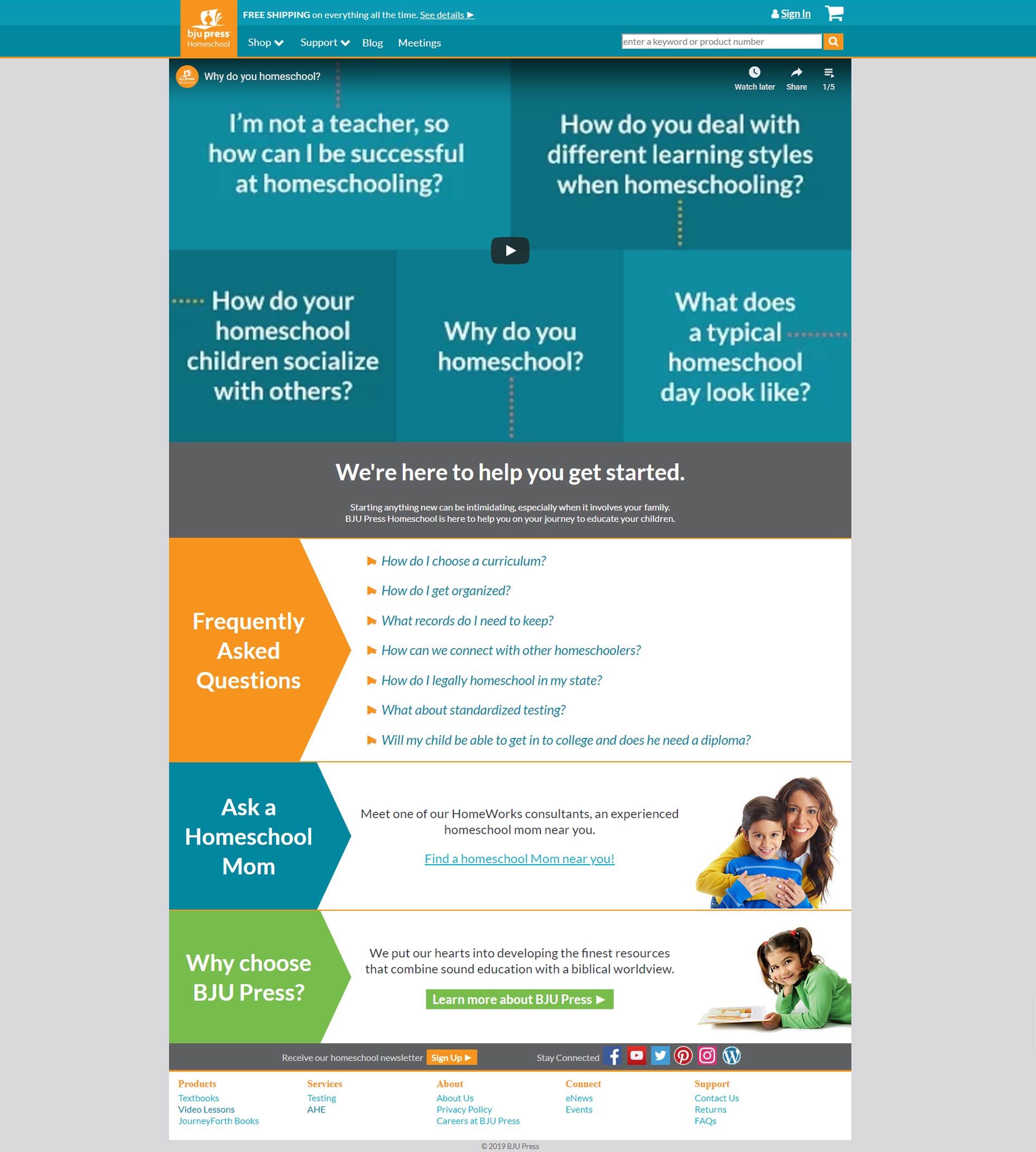
New to Homeschooling
Problem
62.8% bounce rate. Users received information but lacked any clear direction. No structured onboarding, no step-by-step guidance, and no pathways into the product ecosystem.
Solution
Introduced a hero with primary CTAs and free eBook lead capture. Created a "6 Steps to Success" structured framework. Added bottom CTAs directing users to Why BJU Press and shop pages.
Impact
Marketing
Special Offers
Problem
93.2% drop-off rate. The page acted as a complete dead end when no active offers were available. Users who arrived here had nowhere to go and simply left.
Solution
Added prominent next-step CTAs: "Why Choose BJU Press?" and "Shop Our Products." Ensured the page always provided a path forward regardless of current offer availability. Added a countdown timer as an added urgency boost.
Impact
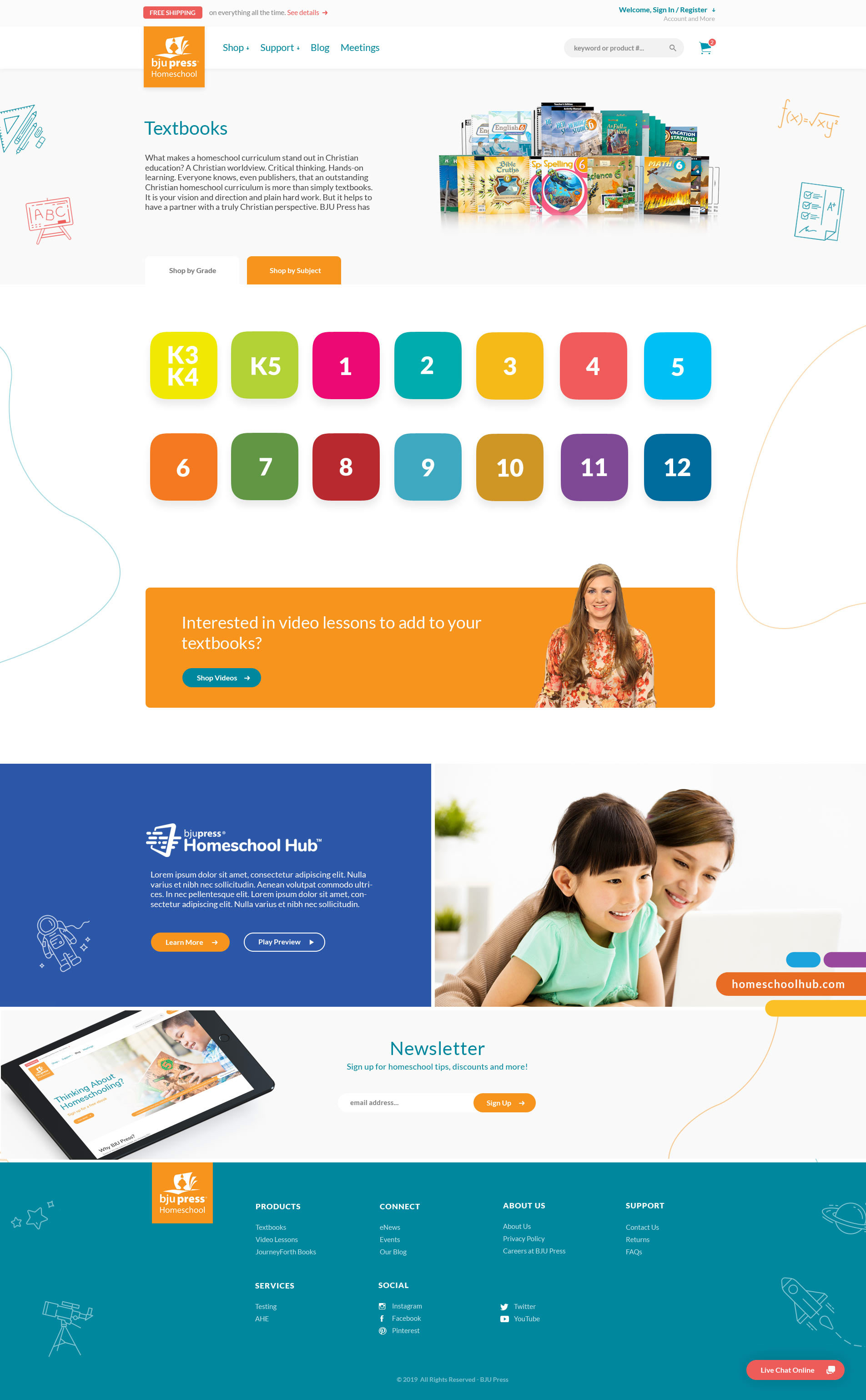
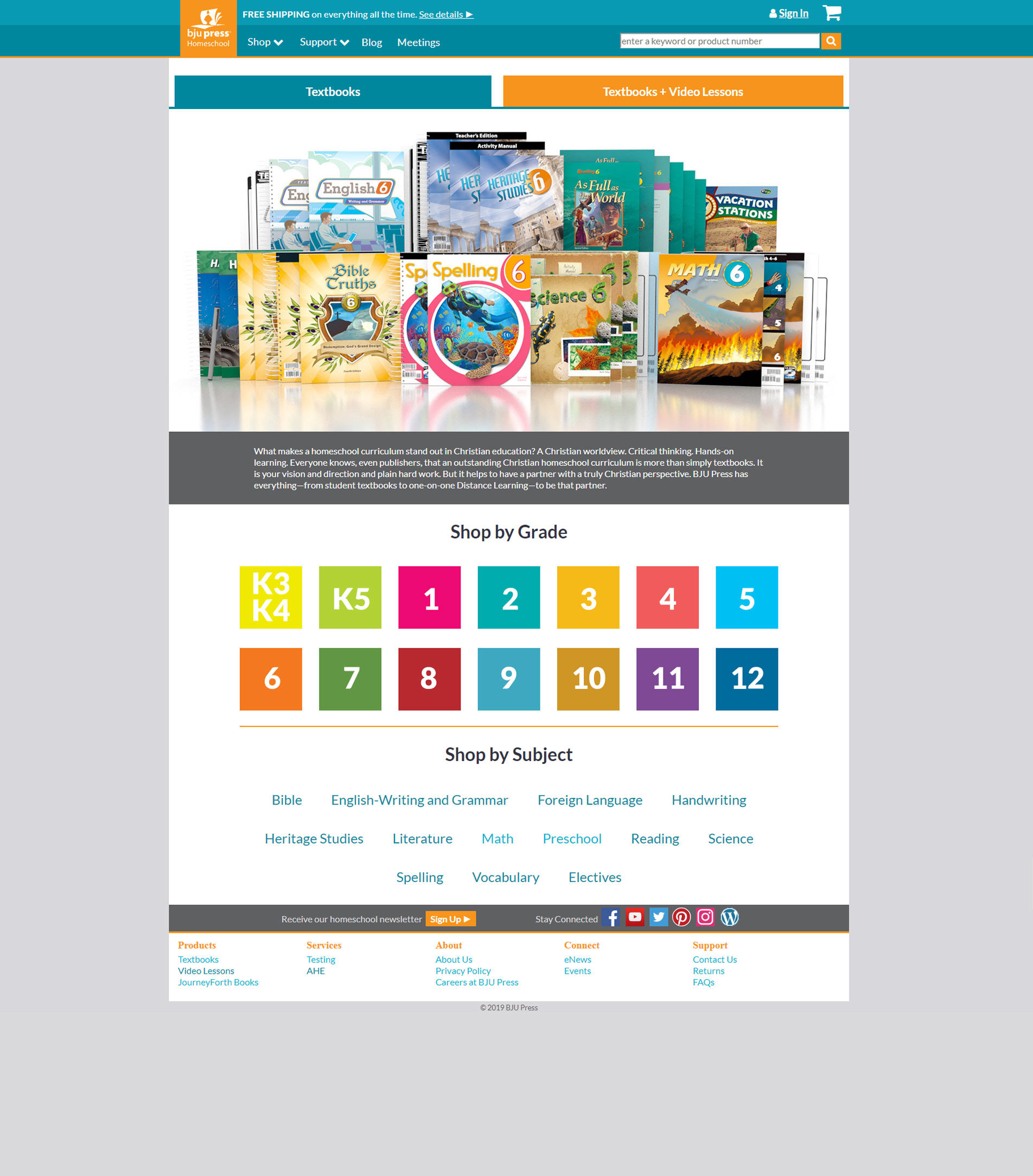
Category Pages
Problem
Grade and subject options were displayed simultaneously, creating a cluttered, high-cognitive-load layout. No clear way to switch between product types mid-browse.
Solution
Introduced "Shop by Grade" / "Shop by Subject" tabs with progressive filtering. Added a cross-sell CTA: "Not interested in videos? Shop textbooks" to increase cross-navigation.
Impact
Less cognitive load while browsing grades and subjects
Increased cross-type navigation between product lines
Clearer path to purchase with progressive filtering
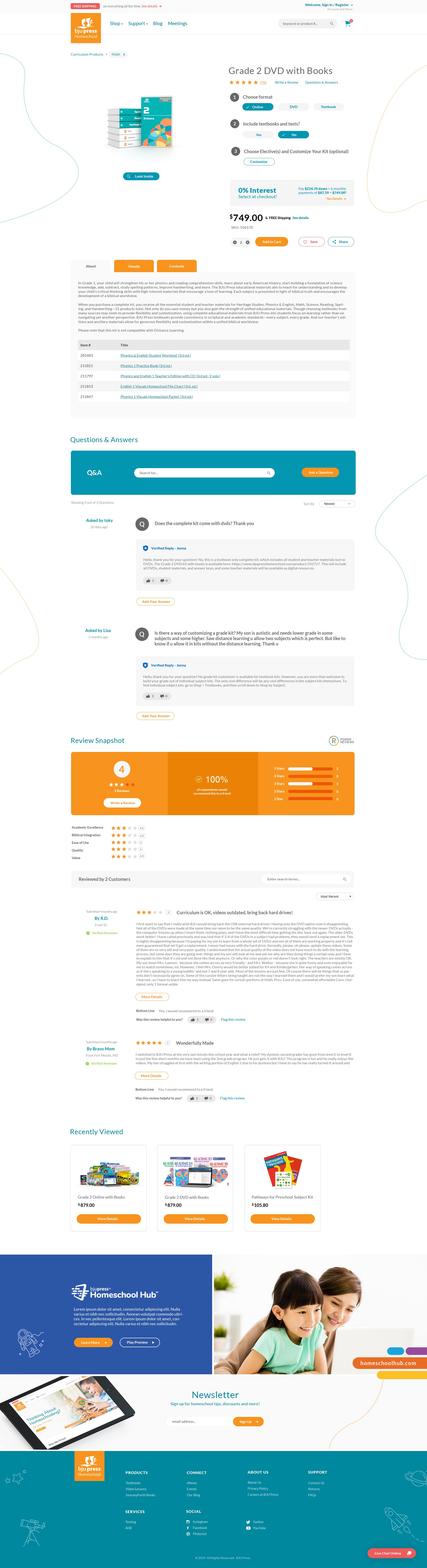
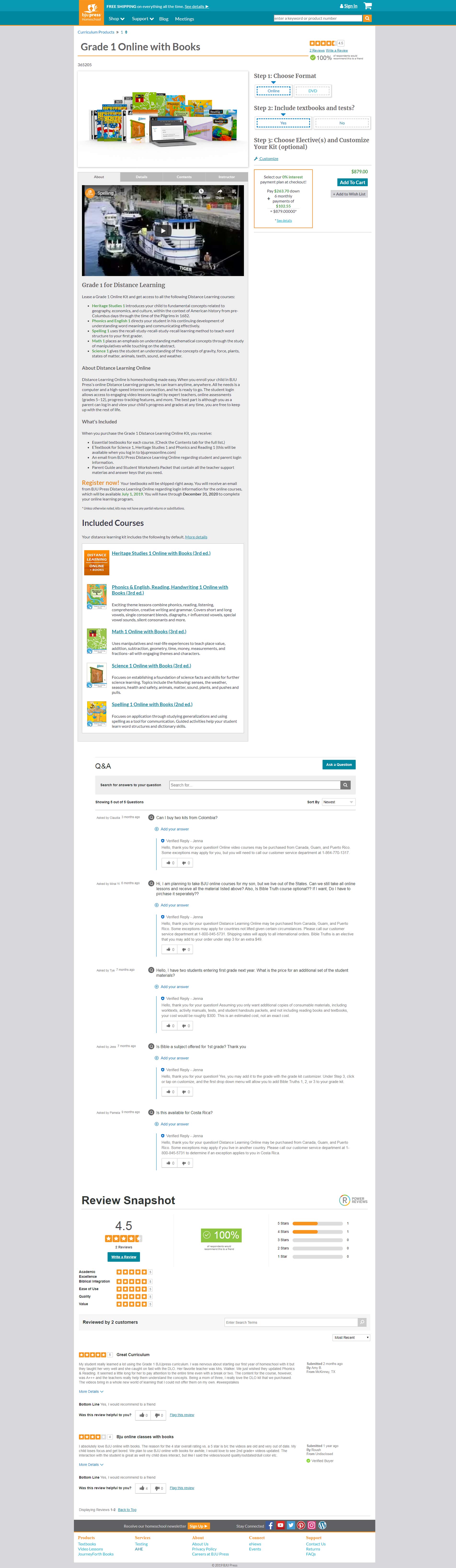
Product Detail Pages
Problem
Cluttered layout with poor visual hierarchy. Reviews and Q&A were placed in low-visibility locations. Key purchase information, pricing and format options, were difficult to find and scan.
Solution
Reorganized layout with prominent pricing, short description + "read more" pattern. Repositioned reviews and Q&A into main content flow. Restyled PowerReviews components to match site. Added social sharing and recently viewed products.
Impact
Increased trust through better review visibility
Reduced friction in the purchase decision process
Improved readability and product evaluation
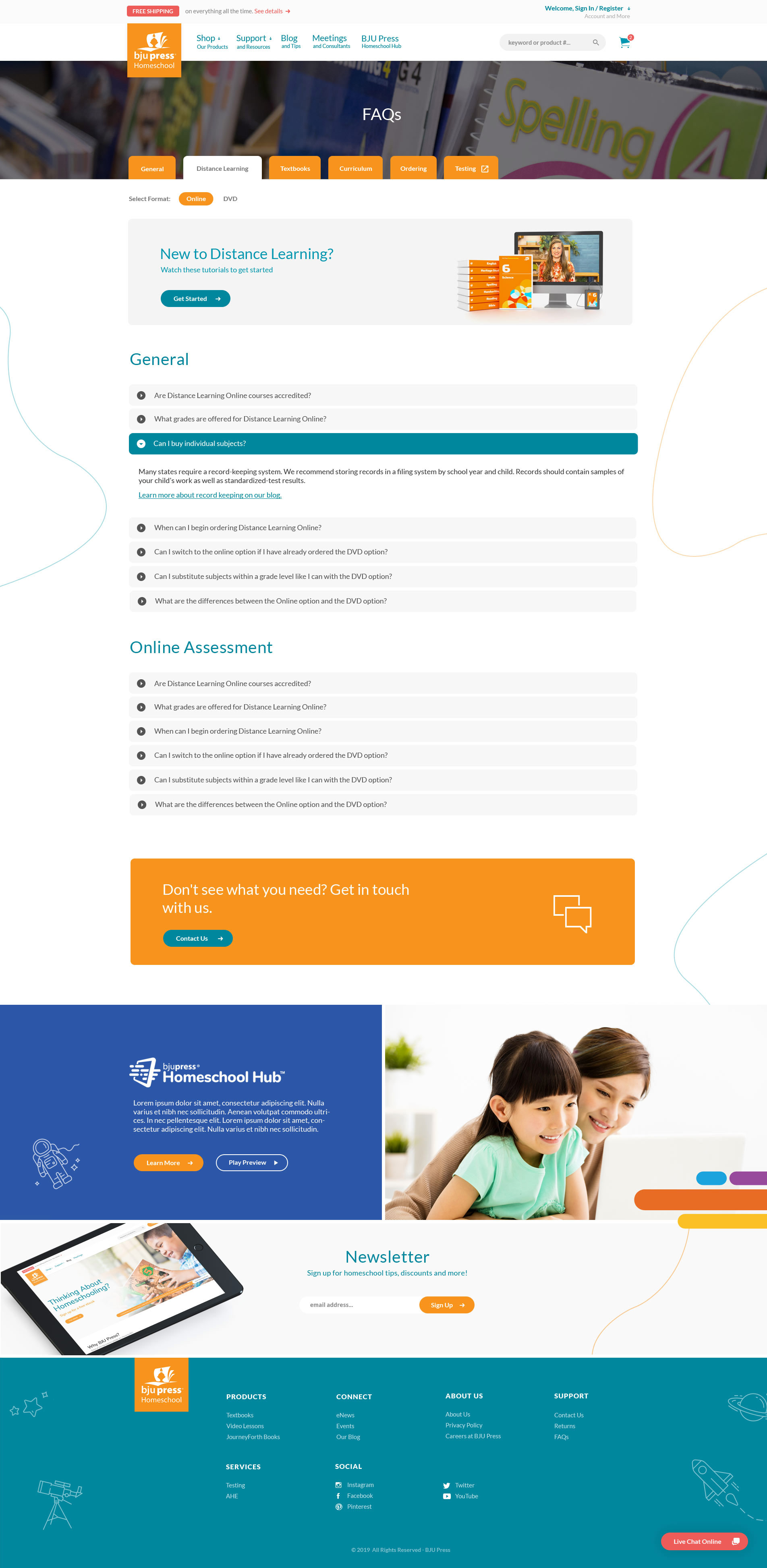
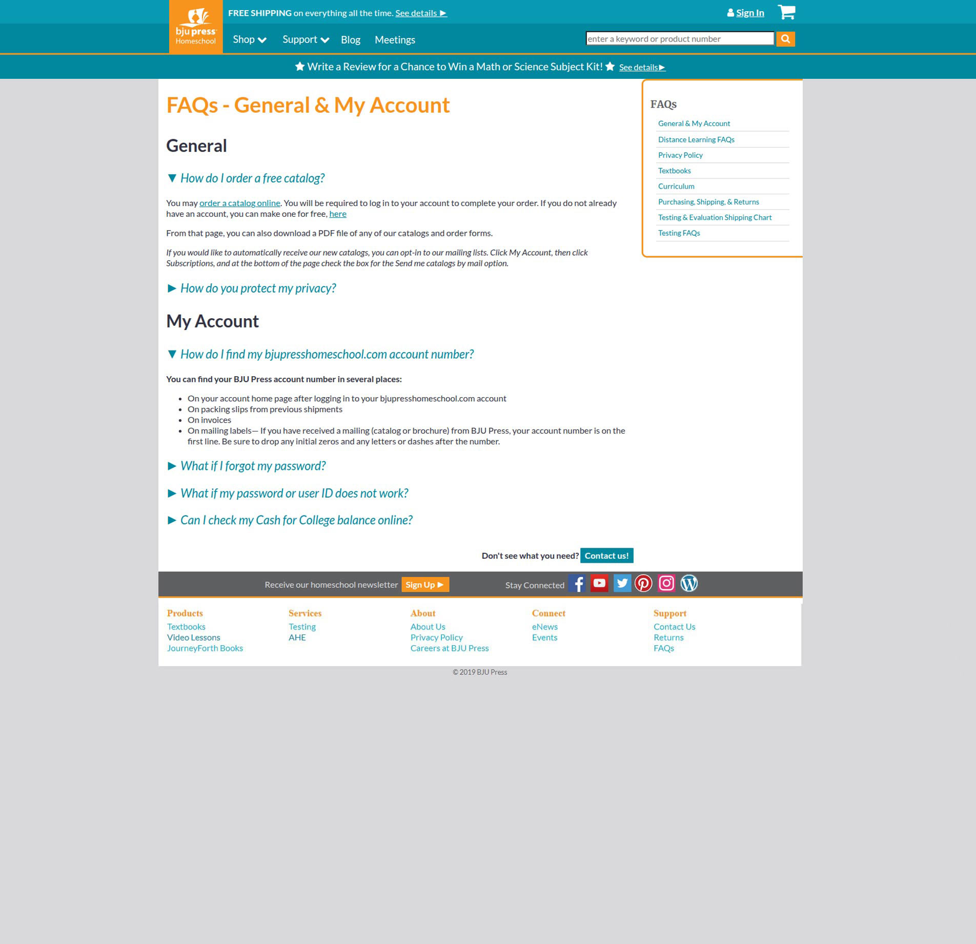
FAQs
Problem
Difficult to scan and navigate. Content organization was unclear, making it hard for users to find answers. Inconsistent UI patterns broke trust with the rest of the site experience.
Solution
Reorganized information architecture for better topic grouping. Introduced an improved tab and accordion system. Standardized layout, spacing, and visual patterns across all support pages. Included CTAs.
Impact
Faster access to support answers
Less friction navigating help content
Consistent usability across all support pages
Responsive
The redesign ensured consistency across desktop and mobile by:
Adapting navigation patterns for smaller screens
Resolving usability issues with touch interactions (e.g., menu scrolling)
Fixing layout inconsistencies across checkout and account flows
Maintaining clarity and hierarchy across all breakpoints
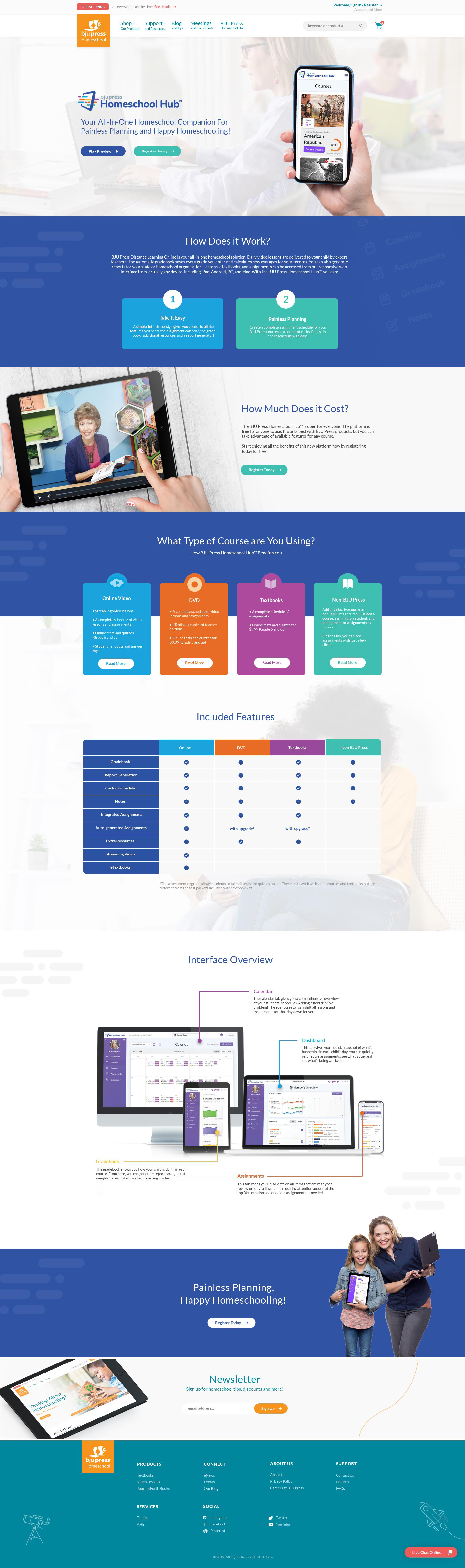
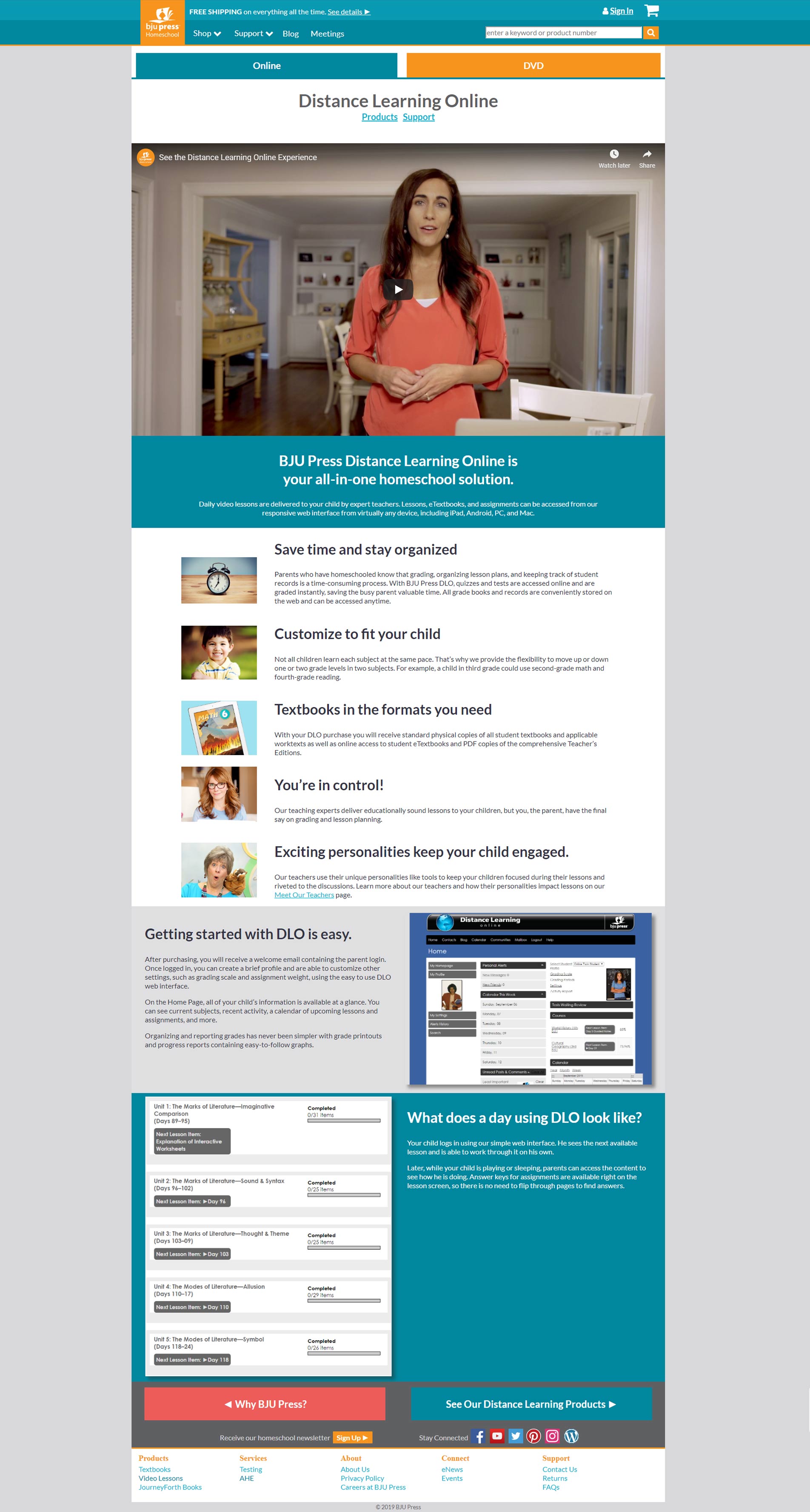
The Hub
Designed a landing page for the Homeschool Hub, a centralized platform for curriculum planning, resources, and community support. Simplified product discovery and clarified value across user needs. Also created scrolling, animated explainer screens to communicate key features and workflows (concept work not shipped).
Feedback
Jonah, our website has never looked or functioned as well as it does now, thank you!
Has anyone else noticed that BJUPressHomeschool.com got a new look! (Maybe I am late at noticing, lol) I Love it!
Everything is easy for me to access, it feels like all the key information is right at my fingertips.
Great job on the site! It really is great.
Impact
This project transformed a confusing decision process into a guided journey. It helped parents confidently navigate and select the right educational path for their children. The redesign delivered measurable improvements across acquisition, engagement, and conversion across key user journeys:


Takeaway
This project marked my first experience leading design and front-end implementation within a large enterprise environment, collaborating across marketing, web, and IT teams with competing priorities and operational constraints. Working from structured user journey documentation, analytics, bounce rates, and CTA performance data pushed me beyond visual execution into more strategic, evidence-informed product thinking. The experience strengthened my ability to balance user needs, business goals, technical limitations, and stakeholder alignment, and to ship scalable, conversion-focused systems that delivered measurable results across every key page.
By aligning product structure, navigation, and content around user intent, I reduced friction, improved engagement, and drove measurable business results.
Next Study
Shape 5
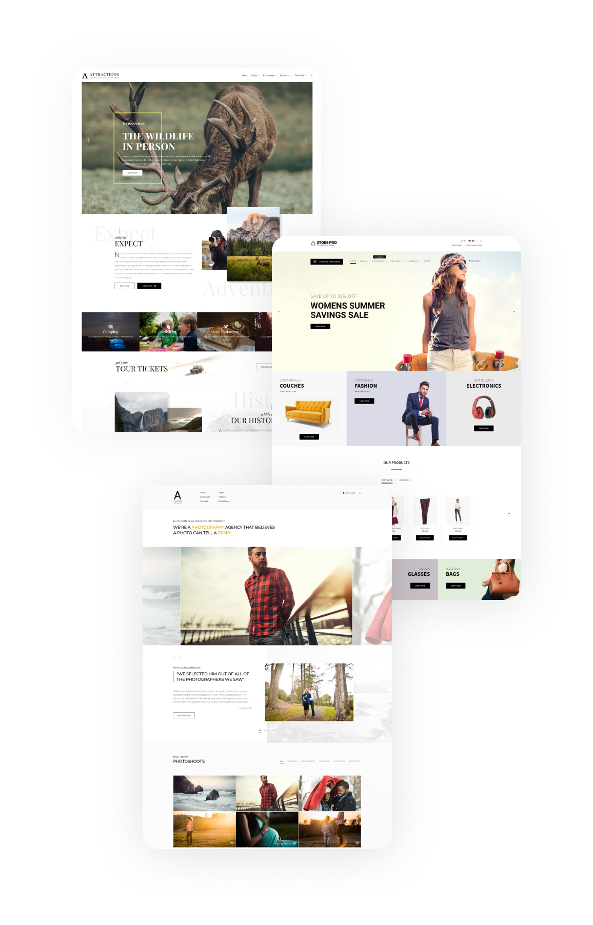
Scaling a Theme Business to 300k+ Users
Co-founded and led a Joomla and WordPress theme club, owning product design and development across 180+ templates and 22 plugins over 10 years.